


How Web Design Best Practices Improve Core Web Vitals
Design as the First Step Toward Better Core Web Vitals
Core Web Vitals are often discussed in technical terms, but their real significance lies in how they connect design with user experience. Before a single line of code is written, design sets the tone for speed, stability and responsiveness. When designers recognise this influence, they can align creative choices with business outcomes and ensure performance is part of the design process from day one.
The Three Metrics Designers Influence Most
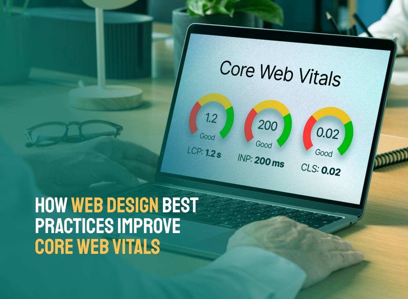
Core Web Vitals go beyond technical benchmarks, they directly shape how quickly content appears, how stable a page feels while loading, and how smoothly users can interact with a site.
- Largest Contentful Paint (LCP): Reflects how quickly the main content appears, often tied to hero images, banners, or headlines.
- Cumulative Layout Shift (CLS): Tracks visual stability, measuring how much elements unexpectedly move as a page loads.
- Interaction to Next Paint (INP): Replaces First Input Delay (FID) as a measure of responsiveness, focusing on how quickly a page reacts to user actions.
A slow or unstable design can frustrate visitors before they even explore the site. That’s why performance must be considered during design, not just development.
How Designers Can Improve LCP, CLS and INP
Each metric is influenced by creative choices, and by addressing them early, designers set the foundation for speed, stability and responsiveness.
Designing for Faster LCP
The largest visible element often defines the first impression of a website. Designers can influence LCP by thinking carefully about scale, placement, and asset choice.
- Hero imagery with purpose: Oversized, unoptimised images slow loading. Instead, select images that communicate the message clearly while being optimised in aspect ratio and resolution.
- Minimal above-the-fold clutter: By prioritising the most meaningful element, headline, product image, or value statement, reduce the chance of large, competing elements delaying the load.
- Typography decisions: Heavy web fonts can delay LCP if text is the largest element. Early consideration of font weights, system font fallbacks, and font loading strategies helps maintain speed.
A balanced design creates visual impact without compromising performance.
Reducing CLS through Stable Layouts
Few things are more frustrating for a user than trying to click a button that suddenly shifts position. CLS is the measure of this instability, and many of its causes are rooted in design.
- Reserved space for images and media: By designing with defined aspect ratios, placeholders, or containers, prevent shifting once the image loads.
- Predictable ad or widget placement: If a site relies on ads, CTAs, or third-party embeds, define fixed areas to prevent unexpected jumps.
- Consistent use of grid systems: A well-structured grid helps ensure elements remain stable across breakpoints and devices.
Designing with stability in mind means fewer surprises for users and a smoother browsing experience.
Supporting INP with Thoughtful Interactions
INP focuses on how responsive a site feels when users interact with it. While the technical execution belongs to developers, designers strongly influence perceived responsiveness.
- Avoiding overly complex interaction patterns: Designs overloaded with animations, transitions, or micro-interactions can overwhelm performance. A restrained approach keeps experiences fluid.
- Clarity in clickable elements: Clear visual hierarchy and adequate spacing reduce the risk of mis-clicks, supporting faster, more confident interactions.
- Anticipating real-world usage: Designers who consider how quickly a visitor can act, whether by tapping a mobile menu or submitting a form, help ensure responsiveness feels natural.
Good design anticipates intent and avoids friction, which naturally improves INP scores.
Balancing Creativity and Performance
The challenge for design teams lies in balancing creativity with performance. A bold hero video may look impressive, but will it slow LCP? A dynamic animation might feel engaging, but could it increase CLS or affect INP?
Performance doesn’t mean dull design. It means prioritising what truly matters, user trust and usability. Creative impact can often be achieved with subtlety such as a lightweight SVG instead of a heavy image, or a micro-interaction designed with restraint rather than excess.
By framing performance as part of the creative process, designers can enhance their role from visual stylists to experience architects.
What to Prioritise in the Early Design Stage
Simple design choices made at the start of a project can prevent performance issues later, helping teams build sites that load faster, stay stable, and respond more effectively to user actions.
- Define aspect ratios and containers for all imagery.
- Select web-safe fonts or provide clear fallback options.
- Limit above-the-fold elements to essentials.
- Use design grids to create predictable structure.
- Keep interactive components purposeful and lightweight.
- Document design specifications for performance-critical elements.
Together, these steps set the foundation for a site that performs well under the strictest benchmarks.
Building Speed Stability and Responsiveness through Design
When small, early choices are aligned with performance goals, the benefits extend through development and into the live user experience. Core Web Vitals may be measured in code, but their story begins in design.
Whether launching a new project or rethinking an existing site, working with a web design agency Toronto based ensures performance is built into every design decision. We focus on creating experiences that are visually strong, functionally sound, and performance ready, aligning our design process with Core Web Vitals benchmarks so your website meets expectations from both users and search engines.