


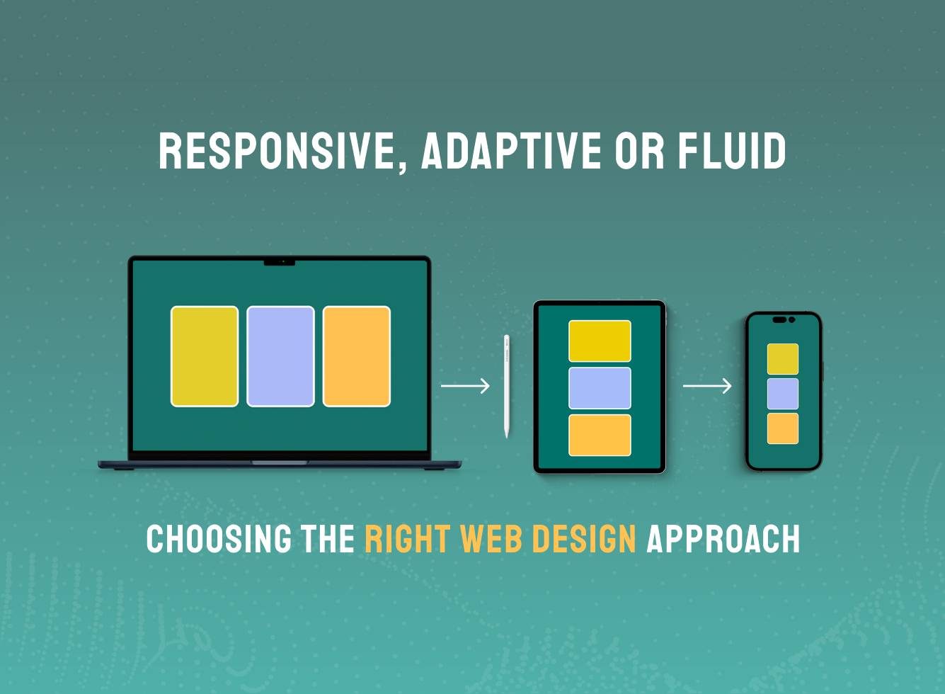
Responsive, Adaptive or Fluid – Choosing the Right Web Design Approach
The Importance of Design Approaches in a Multi-Device World
Websites are no longer experienced on a single screen type. A customer might browse a product catalogue on a phone, compare options on a tablet, and complete a purchase on a laptop all within the same day.
This shift means design can’t be one-size-fits-all. The way a site adapts across devices directly influences usability, brand perception, and conversion. Responsive, adaptive, and fluid design are three approaches developed to meet this challenge, each offering a distinct path to consistent and effective digital experiences.
Responsive Design
The Modern Standard
Responsive design has become the foundation of most websites today. It enables layouts to adjust automatically to different screen sizes, from large desktops to compact smartphones.
This is achieved through flexible grids and percentages rather than fixed measurements. As a screen shrinks or expands, text, images, and navigation menus adjust proportionally to remain usable and visually balanced.
For organisations, responsive design delivers clear advantages:
- Consistency across devices – A single site adapts to desktop, tablet, and mobile, preserving brand identity.
- Efficiency – One responsive site is simpler and more cost-effective to maintain than multiple versions.
- User experience – Navigation and layouts remain clear and intuitive, reducing friction for visitors.
- Future adaptability – Naturally accommodates new screen sizes and devices without major redesigns.
- Faster implementation – Quicker to launch compared to building separate device-specific versions.
Responsive design’s balance of flexibility, usability, and cost makes it the go-to choice for many new websites and redesign projects.
Adaptive Design
Precision and Control
Adaptive design takes a more defined approach. Instead of one flexible layout, it uses a set of predefined templates tailored for specific screen sizes. For example, there may be one design for desktop users, another for tablets, and another for mobile phones.
When a visitor arrives, the site detects the device type and delivers the most suitable version. This allows for experiences that are carefully crafted for each context.
Key advantages of adaptive design include:
- Tailored experiences – Each layout is optimised for the device it’s designed for.
- Performance optimisation – Only the required elements load, supporting speed and responsiveness.
- Flexibility in content delivery – Businesses can emphasise different features on mobile versus desktop.
- Greater control – Design teams can fine-tune layouts for known scenarios and devices.
- Optimised engagement – Customised layouts can boost conversions in device-specific journeys (e.g. mobile checkout).
Adaptive design is particularly effective when an organisation wants a high level of control, or when specific devices dominate customer interactions.
Fluid Design
Seamless Scaling
Fluid design, sometimes called liquid design, focuses on proportional scaling across all screen sizes. Instead of relying on fixed breakpoints or templates, elements expand and contract in direct proportion to the screen.
For example, if an image is set to occupy 40 per cent of the page width, it will always take up that proportion, whether the screen is narrow or wide. This creates smooth and continuous adjustments as users move between devices.
Benefits of fluid design include:
- Seamless adaptability – Content scales proportionally to fit any screen dimension.
- Future-readiness – Designs remain effective even on devices not anticipated during development.
- Visual balance – Proportions stay consistent, maintaining a polished look across devices.
- Immersive layouts – Particularly effective for creative or highly visual experiences.
- Continuous transitions – Users enjoy smooth resizing without abrupt changes between breakpoints.
Fluid design requires thoughtful planning but can deliver highly flexible and visually engaging results. It is often combined with responsive elements to achieve both structure and smooth scalability.
Comparing the Three Approaches
Responsive, adaptive, and fluid design all aim to deliver strong digital experiences across devices, but they do so in different ways:
- Responsive relies on one layout that flexibly adapts to screen sizes, making it a versatile and efficient standard.
- Adaptive uses predefined layouts to provide precision and control, tailoring experiences where user expectations differ.
- Fluid applies proportional scaling, creating natural transitions and visual balance across both familiar and emerging devices.
These methods are not exclusive. In practice, design teams often blend them for example, using a responsive foundation while adding adaptive layouts for specific contexts or fluid scaling for greater visual harmony.
Choosing the Right Approach for Your Business
The right choice depends on customer expectations, project objectives, and long-term growth plans:
- Responsive suits organisations seeking broad accessibility and cost efficiency with one site serving all audiences.
- Adaptive is valuable when performance and tailored experiences are critical across different devices.
- Fluid is ideal for brands prioritising design flexibility and balance across varied or emerging screen types.
The decision is not about superiority but about alignment. Framing the choice around goals, whether improving conversion, supporting international audiences, or preparing for future platforms ensures the design approach delivers measurable value.
The Role of Clarity and Understanding in Digital Decisions
Clarity around these terms reduces miscommunication, sets realistic expectations, and helps businesses make informed digital investments. When organisations and design teams speak the same language, projects are scoped more effectively, budgets are better allocated, and outcomes align with long-term brand strategy.
Clear understanding transforms design discussions from a source of confusion into a foundation for confident, value-driven decision-making.
Building Future Ready Digital Experiences with Design
Responsive, adaptive, and fluid design address the same challenge of delivering engaging experiences across devices. Each offers unique strengths, and in many cases, a combination provides the most effective solution.
By understanding these approaches, organisations can work with web design agency in London to choose methods that reflect brand vision, support customer needs, and build future-ready digital experiences.