


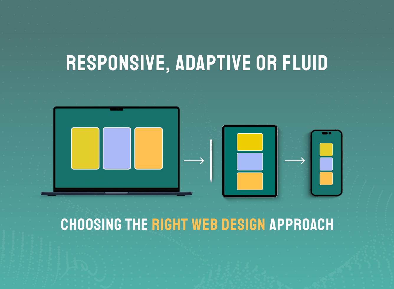
Why Your Website Needs to be mobile-friendly or responsive

The era of desktop-dominated internet searches is firmly in the past. Numerous studies have highlighted this shift, including a 2016 report from web analytics company StatCounter, which confirmed that mobile searches had officially overtaken desktop usage on a global scale.
According to the report, 51.3% of global searches were conducted via mobile devices, compared to 48.7% on desktop. Country-specific figures reveal an even more pronounced trend: India leads with 75% of searches via mobile, followed by 58% in the US and 55.6% in the UK.
Visibility Starts with Mobile Access

If your website isn’t mobile-friendly, you’re missing out on a large share of potential traffic. Search engines like Google prioritise mobile-responsive websites in their rankings, and poor mobile usability can cause your visibility to drop – even in desktop searches. A non-responsive website may struggle to reach the audience it deserves, no matter how good the product or service.
Performance Matters Across Every Device

Visibility is only the first step. Your site also needs to function seamlessly on every device. Whether a user is browsing from a phone or tablet, they expect your site to load quickly, display clearly, and provide a smooth experience. Slow performance or awkward layouts lead to instant drop-offs – especially on mobile, where attention spans are shorter and patience is limited.
Responsive Design is Now the Standard

In the past, this might have meant designing and building two separate sites – one for desktop and one for mobile. Modern web design has moved beyond this to embrace responsive design, however, meaning that the same site works equally well no matter how it is accessed. That means it has to meet the following criteria:
Consistent Visual Experience on All Screens
the colours and designs used need to work well on screens of any size and to deliver a consistent brand message. If branding works well on a larger scale but not when reduced in size then the message your online presence is sending out becomes confused. Not only that, but your professionalism is compromised. Someone impressed by your website on their desktop who then tries to access it when out and about the next day will be deeply disappointed to find a mobile site which doesn’t replicate the experience. Even worse, they’ll assume that this lack of attention to detail runs through everything else you do.
Intuitive Navigation for Mobile Users
Navigating via a smartphone is different from the point and click standard which has applied for so long. Your site needs to be instinctive to navigate, guiding visitors forward fluidly and making it easy for them to find what they need.
Responsive design is no longer a forward-thinking choice – it’s the current standard. Today’s users expect every website to work flawlessly across a wide range of devices and platforms. Leading brands and competitors alike have already adopted mobile-first design as the norm. If your website still isn’t responsive, now is the time to act – or risk falling behind in a mobile-dominant digital landscape.
Mobile-First Design as the New Baseline
Responsive design is no longer a technical upgrade or a forward-looking feature – it’s the baseline. Users form an opinion about your business within seconds, often based on how your site performs on mobile. From usability and SEO to conversions and brand trust, mobile-first design is essential to staying competitive in a mobile-led world.
Taking the Next Step in Responsive Web Design
Being mobile-friendly isn’t an optional upgrade – it’s a fundamental part of how people experience your business online. From SEO rankings to user engagement, responsive design directly impacts visibility, trust, and conversion.
Our web design London team builds performance-led, responsive websites that adapt beautifully across every screen size – without compromising creativity or brand identity. Whether you’re launching something new or rethinking your current setup, we design digital experiences that keep your audience connected, engaged, and ready to take action – anytime, anywhere. Let’s build a website made for today’s users – and tomorrow’s expectations.